20 Minuten
| Date | July 25, 2017 |
| Tags | Newspaper |
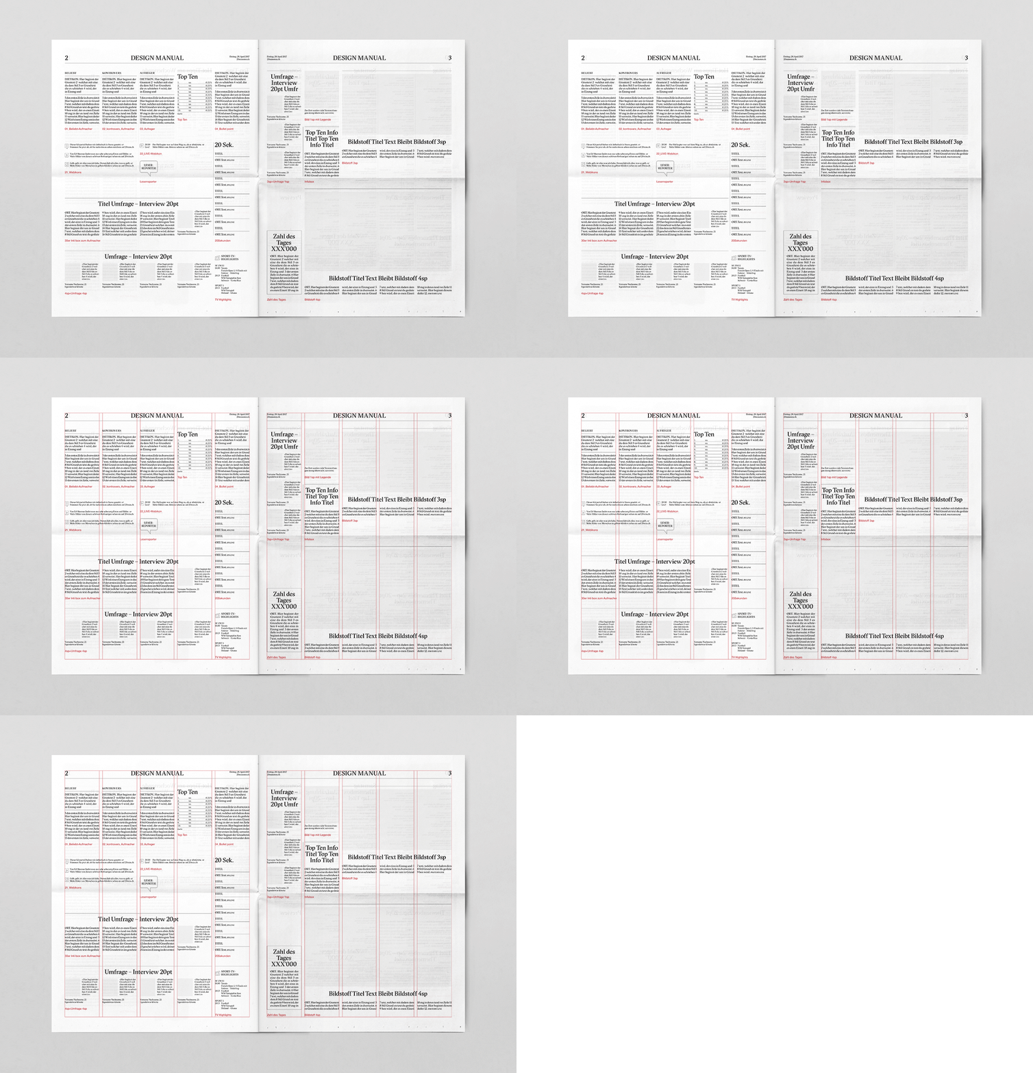
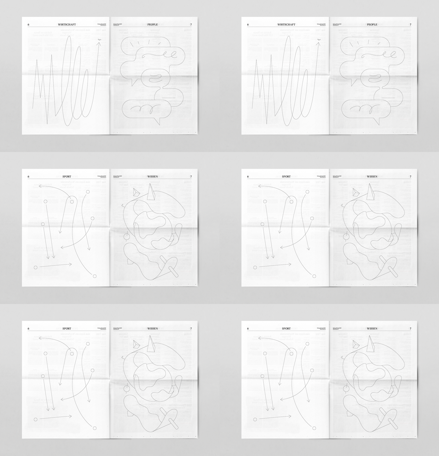
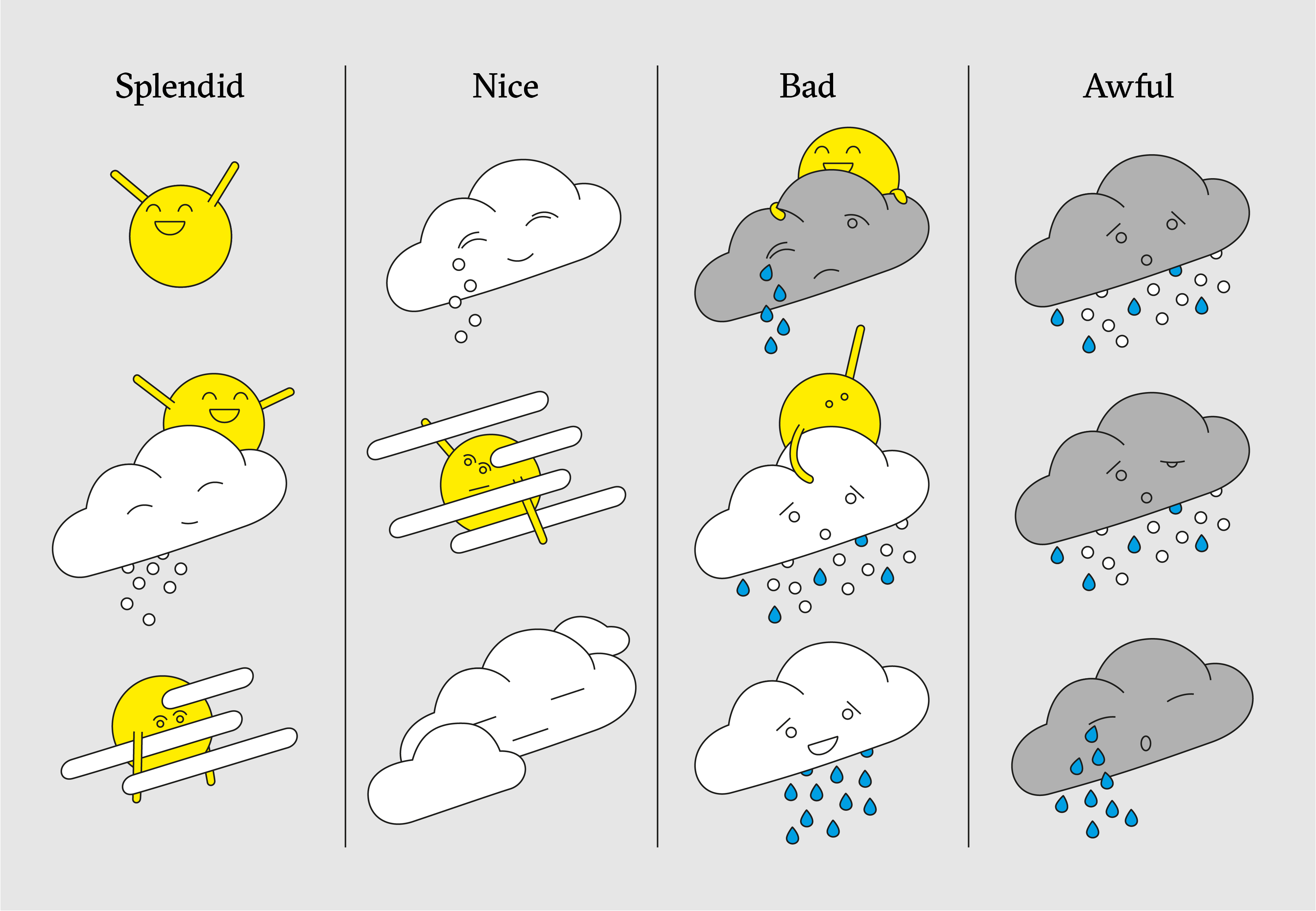
We had the pleasure to completely redesign the «20 Minuten», the most widely read newspaper in Switzerland, as part of a campaign for Samsung. In collaboration with the agency «Jung von Matt» we designed a newspaper that was – for once – intended more to be looked at, than read. An unbelievable feat. In a first step, we redesigned the entire layout with all its nuances, such as the visuals of the horoscopes, the logos of the television stations, a tragically-odd comic, or an emotional weather map. What’s usually developed in months of hard labor had to happen within a few weeks. Nonetheless, we decided not to leave it as a redesign. On a second layer, each page was confronted with a colourful interpretation of its content. This way, not only the design edition itself became unique, but every single page within.


